|
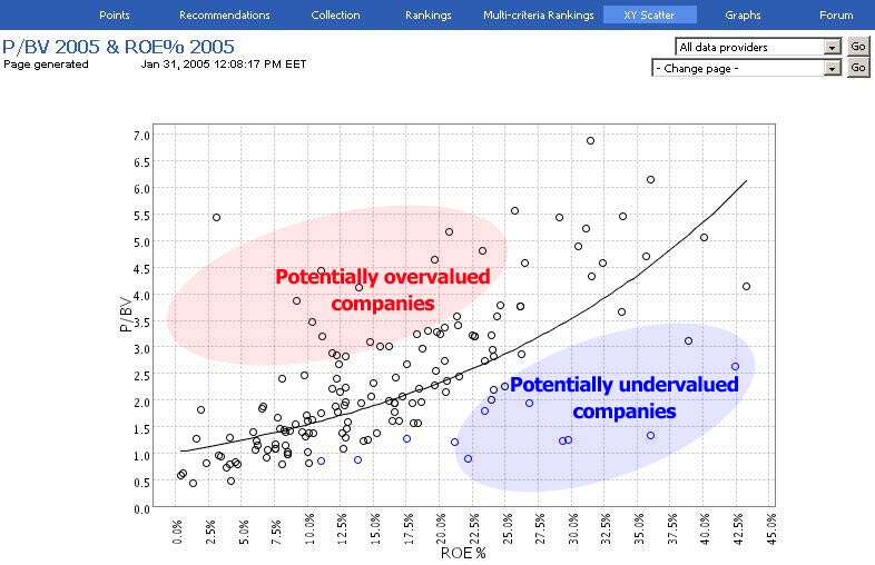
How to interpret Valuation scatter
Briefly
|
Scatter graphs illustrate graphically
what kind of valuations companies have relative
to their growth or profitability prospects.
Companies are plotted in the graph so that the
potentially undervalued companies are normally below
the trendline and overvalued companies are above
the trendline. The most interesting companies are
also presented with blue font, both in the graph
as well as in the table below.
|
Click
picture to enlarge image |
So the same companies are also shown in the table below
and also sorted so that the most lucrative (undervalued)
companies are on the top.
Acid test with history parameters
Notice that there are also graphs/tables where the parameters
are based on historical figures: e.g. P/E 2002 (Y-axis)
is compared with EPS growth 2002-2004. The sole purpose
of this kind comparisons is to show and prove the importance
of this kind of review. As you might see in this kind
of graphs, "the most lucrative companies", i.e.
the coloured companies, are often also exactly those companies
that have outperformed the market significantly in the
past.
However, you must also bear in mind that this does still
not prove that the future oriented scatter graphs and
tables (e.g. scatter with P/E 2005 and EPS growth 2004-2006)
would be as succesfull as the historical graphs: in the
future graphs the explaining parameters (EPS growth in
this example) are based on future
analyst estimates and as we all know they are not
always too reliable...
Valuation at Y-axis, explanation at X-axis
The scatter -graphs at Valuatum Platform are always constructed
according the following pattern:
Y-axis - valuation parameter
Y-axis represents always the valuation-axis/valuation
parameter: the higher the company is in Y-axis, the more
expensive is its valuation (e.g. according to P/E, P/BV,
EV/EBIT). However, in some cases high valuation in Y-axis
is more than compensated with X-axis parameter so e.g.
estimated growth or high profitability and thus at the
end the valuation of the company might even be lucrative
(so the company might still be under the trend-line).
X-axis - explanatory parameter
The X-axis represents the explanatory parameter: it kind
of explains why the valuation is high. E.g. one scatter-graph
has P/E as Y-axis and future EPS growth as X-axis. This
is because high P/E normally means that markets expect
that the EPS of that company is growing in the future.
Trendline reveals correlation
Normally the whole population of companies are placed
in the graph so that, on average, the companies with higher
valuation multiples have also higher growth or other explanatory
parameters. Therefore the trendline, drawn based on all
companies, also normally slopes upwards.
However, there seems to be some cases where the trendline
is flat or even very slightly sloping downwards and thus
suggesting that there is no real correlation between some
valuation multiple and corresponding explaining parameter.
Of course this might reveal that perhaps the parameters
on Y-axis and X-axis are not very perfect match. I.e.
the explaining parameter at X-axis is not very good in
explaining the valuation parameter in Y-axis.
If we talk about future estimates it might also be possible
that the analyst estimates are unreliable. And the last
explanation is that "market just has not found these
companies". This might appear to be unsound assumption
which underestimates the effectiveness of the market in
valuing companies correctly, but please be open-minded
and look e.g. the graph/table of MVA/EVA 2002 and EVA
growth 2002-2004: the graphs shows the following companies
as the top-15 companies and thus suggests that they were
the ones that had lucrative valuation back in 2002:
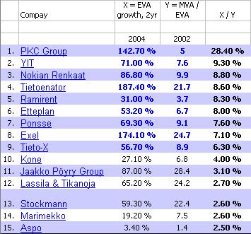
...and as we all know these 15 companies have almost
all turned out to be very good performers during 2002-2004.
Still the correlation between these parameters has not
been too strong as you can see from the corresponding
graph and its trendline slope below:
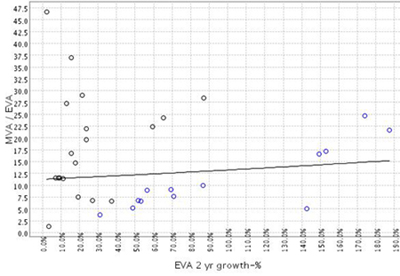
The weak correlation e.g. in this graph above tells us
that the market has not been able to forecast the good
performance (EVA growth in this example) of these companies
and thus it has undervalued those 15 companies back in
2002. Thus, in our opinion, these figures and graphs reveal
that there are a lot of opportunities within the market
to plot lucratively priced companies with fundamental
analysis. Again, we would like to remind users that the
useful, future oriented scatter graphs are only
as good as the estimates underneath them.
Scatter graph parameters
We have scatte graphs (pages) constructed from following
parameters:
|
Y-axis (valuation parameter)
|
X-axis (explaining parameter)
|
|
P/E
|
EPS growth
|
|
P/BV
|
ROE-%
|
|
EV/EBIT
|
EBIT growth
|
|
MVA/EVA
|
EVA growth
|
In each of these cases the parameter at X-axis should
be theoretically quite good in explaining the valuation
parameter at Y-axis. If you would happen to have in mind
some parameters that would still be suitable for scatter
graphs and tables, please
inform us about them and we will put also them on
our system.
Warning - valuation scatter only as good as forecasts
One should bare in mind that all the X-axis parameters
that present future values (future growth, future profitability
etc.) are only as good as the underlying analysts estimates.
And as we all know, analyst estimates are almost never
exactly right. Therefore, before making any hasty conclusions
based on what companies seem to be undervalued according
to XY-scatter graphs, one should always click the corresponding
company name in the table and look what kind of estimates
the analyst has used and what kind of arguments the analyst
has behind his/her estimates.
You can find more information about valuation theory
with e.g. "P/BV - ROE-%" and "MVA/EVA -
EVA growth" scatters from the EVA
valuation tutorial. The presentation reveals very
illustratively how these parameters interact with each
other and why.
|